I’ve always been a spiral planner girl, but this year I’m trying out the binder system. You can’t beat the customizing options and organizing capabilities of ring-bound planners. Let me tell you, my Limelife A5 planner inserts have me seriously approaching planner peace! Limelife designs are vibrant, their layouts are straightforward, and everyone knows their quality is top-notch! Here’s how I’ve set up my binder system so far.
GETTING STARTED
My approach has been pretty slow and steady. My creative heart wants to deck my planner out with cute clips and page markers, stuff the pockets with more pretty page flags than I can ever use, dangle fluffy and shiny charms from the strap, and line the page edges with all things adorable. But I have other planners for that! My yellow Kikki K is strictly (okay, mostly) for getting things done and keeping my life in order. I need to be able to focus on my tasks and access information without getting distracted by shiny things. I’m using a few extra planner accessories, but my Limelife inserts provide a good fix of decor so that I won’t feel bored with my simple set-up.

FRONT POCKETS
- Quality page flags for long-term notes
- Cheapo page flags for quick throw-away notes
- A few paper clips
- A simple mini notepad
- A couple of sturdy note cards
- Some washi for taping down miscellaneous notes and bits
- Inspirational art card handmade by a dear friend
- SECRETARIAL POCKET: Dottie Mini Notebook and paperwork/mail collected throughout the week. I try to clean it out weekly.
NON-DASHBOARD
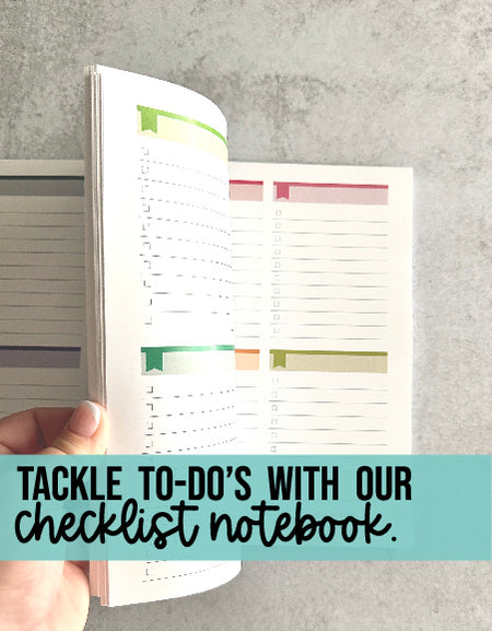
Dashboards are pretty popular in the planner community. A typical dashboard is a sort of title page that houses sticky notes, inspirational quotes, or photos. I decided a dashboard would be redundant since my pockets have all of that. Instead, my first page is always my right-now planning page, usually a daily planning insert. It’s front and center, with no searching or section flipping to distract me. I use several different inserts depending on my needs. This Checklist Add-On insert is perfect for me, since I naturally tend to categorize my to-do lists. The add-on comes with 30 pages in two colorways. Check the Limelife site out for other layouts that might also work for you, and for the digital version of the checklists.
CALENDAR

I’m using Limelife A5 weekly planner inserts with the Elizabeth design. My weekly layout is a classic horizontal week-on-two-page format. Limelife has tons of designs from floral to stripe to watercolor, and several different layouts to choose from. This set is more than just calendar inserts. Here’s a rundown of what’s included:
- Monthly pages, including tabbed dividers for each month
- Weekly pages, with your choice of layouts
- Accounts/passwords
- Contacts
- Holidays/special dates
- Goal-setting
- Lined note pages
- Customizations: 3-hole punched, 6-hole punched, or unpunched; start month of your choice; layout format of your choice

One of the best features of Limelife is that ALL of their planners (A5 and spiral), are customized with your choice of start months. So, if you’re ordering in March, you get your money’s worth with no wasted months. I only include a couple of months at a time in order to minimize binder bulk. My “Calendar” section houses my monthly overview, and the monthly tabs house the weekly spreads.

SECTION TABS
The Decorative A5 Planner Tab dividers come unlabeled for you to use how you choose. I adhered clear labels from my label printer to the front of each of my tabs. Since I no longer need my past months, I’m borrowing the January divider from my calendar inserts. A strip of thin washi hides the original wording so I can re-purpose it.
I use an oversized divider to block off the rest of the sections that I access less frequently. Onto coordinating yellow cardstock, I traced around one of the original dividers that came with the planner and added a little extra width. This cuts down on the visual clutter to minimize distraction.
MY SECTIONS
I allowed myself a few weeks to use a temporary setup to really figure out my organizing needs. Hand-labeled mini page flags were a great solution for that. I stuck them onto my unlabeled tabbed dividers until I knew what I wanted to label them. I ultimately determined the following sections would work for me:
- Business—for info that I access frequently, or that I will transfer to my dedicated business binder later on
- Look Up—for book/podcast/app titles I want to look into, wish lists, websites to research, etc.
- Friends & Family—contact info, birthdays, important things about their lives that I should remember but tend to forget, date ideas, etc.
- Social Media—content ideas, design team details, tips
- Personal—health, journaling, self-improvement, travel
- Inserts & Stickers— I’m using A5 punched sticker sheets and varying inserts (lists, charts, graph paper, etc)
- Notes—Blank/lined note pages (I’ll be absorbing my inserts into this section soon).
SUBSECTIONS – When I accumulate several pages of the same topic, I like to create subsections. Narrow page flags are great temporary tabs. They can be hidden behind the main section tab to reduce the visual clutter—see the little blue subsections under the red Notes tab?

THE PEN!
I’d be remiss if I didn’t tell you about my pen! My favorite pen to use on Limelife paper is a black Staedtler Triplus Fineliner. It writes on Limelife paper with no bleeding and dries instantly.
Limelife A5 Planner Inserts, coupled with their Decorative Tab dividers have been a huge factor in helping me develop a planner system that works. My binder setup is still a work in progress, but I’m sure planner peace is just around the corner.

This blog post was written by Meka Allen for the Limelife Planners Media & Creative Team. For more information about Meka visit her on Instagram @yespleaseplanning. Please share and repost this blog entry with your friends! All we ask is that you give credit to Limelife Planners and the post author.


